Sunday, 4 January 2009

Studio 4 | Usability Tools

203CR - Designing for Usability 2

Studio 4 - Usability Tools

For this assignment I will be analysing one my mobile phones which is the Sony Ericsson K750i.


The K750i is a fully featured phone with video camera, digital music player, FM Radio, Bluetooth, memory stick, triband and etc. It nearly has everything what a person would be looking for in a mobile phone.

Affordances

This phone is simple and quite straight forward to understand. It’s not very hard to use but does have a few stuff that could make an individual confused in terms of how some of the material works.

The screen is clear and the keys are basic to see. The size of the phone is nice and small so it is easy to fit in your pocket and light to carry.

Mappings

The buttons are quite straight forward but there are some problems with the button which could confuse a person at first in how to answer or how to end a call.


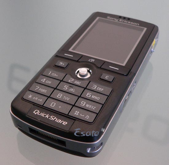
From the picture for “Answer call” and “End call” the signs they have used is “ - “ which don’t really clarify that these are the buttons to answer a call or to end a call. Otherwise for the keypad it is simple and easy to use, also the navigation button (the cursor) is effortless for example if you move up or down then it will scroll up and down, its just that simple.


Constraints

The charger for this phone is designed so that it can simply be inserted correctly. This is achieved by its shape so that it won’t be able to fit in any other way but the port of the charger could made easier for a being to know which way it gets inserted in for example they could of put a Lettering or a sticker stating which is the right way to connect the charger to the phone.

Conventions

The only fault I would say as a convention is again is to pick up a call and to end a call which is the only convention I found which is not followed, traditionally in older phones it was they used the colour “green” to answer calls and “red” to end calls. Otherwise I can not see any other conventions and the phone is quite straight forward to use by a human being who is in need of a decent mobile phone.


What’s a Scenario?


It’s a story of how an imaginary person might need to work with a technology. For example ‘John is in the Quit Zone on the Virgin train. He wants to check his texts but to do that he has to stop his phone making any noise. So he has to switch off all the sounds.


In order to do this he has to unlock his phone first by clicking the hash button and then click on the answer button, by doing this the phone will unlock which the phone does guide the user by displaying on screen on how to unlock it. After this he clicks on menu and scroll down to find "silent mode" which he clicks on, once he has clicked on the silent mode the phone would vibrate to notify the user it is on silent now.


What's a Function?


In our culture, green means 'go', and red means 'stop'. This is a cultural constraint, that is, an arbitrary learned convention that we all understand - one of Norman's design principles. It makes sense, then, to apply this as a design principle to the start/ end call functions, as people associate green with starting and red with stopping. At the same time, because we read from left to right, what is on the right comes after what comes on the left, so again it makes sense to put the stop button to the right of the start button, as we end a call after we have started it (indeed it is impossible to do otherwise!). This again shows that a cultural constraint (a different one) has been used in the design, so two different cultural constraints have been used for the function.


Thursday, 6 November 2008

Studio 2 | Reading Week

Studio 2 - Reading Week

1) What does "usable-in-life" mean?

"Usable-in-life" is a expression to state if a gadget or device is launched in a non isolated testing room and into the real world, from there see if the device is user friendly.

2) How is usability-in-life different to usability-in-itself?

Usability-in-itself is the term of a gadget or device which get tested in a isolated testing room, but where usability-in-life is where the gadget or device is launched in the real world.

3) How is the iPod designed to be both usable-in-itself, and usable-in-life?

The way the iPod was designed, when tested in a isolated room, it perform all the individual task in a reasonable amount of time, which shows its usable-in-itself. And when the iPod was thrown in the real world, the tasks still work in a reasonable time, therefore proves it is usable-in-life.

Studio 1 | Reading Week

Studio 1 - Reading week

After reading "Everyware" the definitions of pervasive computing I found was:


  • Information technology will appear in many different context and take a wider variety of forms, but it will affect almost every one of us, whether were aware of it or not.

  • Desktop machine per se would largely disappear as the tiny, cheap microprocessors that powered them faded into the built environment. But computation would flourish, becoming intimately intertwined with the stuff of everyday life.

  • Computing has leapt off the desktop and insinuated itself into everyday life.

  • Meant not merely "in every place", but also "in every thing".

  • Mark Weiser - A computing that "does not live on a personal device of any sort, but is in the woodwork everywhere".

  • Most of the functions we now associate with these boxes on our desks, these slabs that warm our laps, will be dispersed into both the built environment and the wide variety of everyday objects we typically use there.

  • A "tangible media" extending computation out into the walls and doorways of everyday experience.

  • In 1989, workers wearing an active badge in an instrumented building could automatically unlock areas to which they had been granted access, have phone calls routed to them wherever they were and create running diaries of the meetings they attending.

  • Information processing embedded in the objects and surfaces of everyday life.

  • Elements like walls, roofs, tables and seating, clothing. And, of course, the body itself- Our original and our final home. In everywhere, all of these present appealing platforms for networked computation.

  • Dor Norman - Difficulty and frustration we experience in using the computer are primarily artefacts of its general - purpose nature. A truly human - centred design would explode the computer's many functions into a "quiet, invisible, unobtrusive" array of networked objects scattered throughout the home: simple, single-purpose "information appliances" in the form of shoes, bookshelves, even teddy bears.

Saturday, 25 October 2008

Studio 3 | Creative Design Approaches

203CR - Designing for Usability 2
Studio 3 - Creative Design Approaches
- For just Two of these, describe what you think the issue is.
In Picture 98 what I see is a toilet with a handrail where a newspaper is on it so when someone wants to use the toilet there is a paper for them to read. Also there is two toilet tissue rolls for incase of one of the toilet tissue roll runs out.

In Picture 54 what I see is a big car park with a lot of allocated car park space for each car so that each car has enough space to open there doors without hitting any other cars and making it easy for them to get out of there car instead of trying to squeeze out of there cars because there’s only so much space for them to do so.
- For just one of the examples, describe how we could make a design change or innovation to change and help what is happening.

Observing from “Picture 132” it looks like people are sitting there to themselves and reading there newspaper and books while drinking there tea. From the picture it looks like the people are sitting spaced out from each other, trying to get there alone and personal time.

The way I would change the design is by getting rid of the extra space and install seats with something to lean on also an object like a small flip out table where they can put the drinks and food. In the extra space I might install some vending machines which will provide drinks like coke, coffee, tea or snacks like chocolate. And maybe I would put in a news stand where people could get newspapers and magazines. Also I would make sure there some bins available around that area for the people to dispose there rubbish, with this it would keep the area clean and tidy for the people and the environment.

From these new improvements there could be down sides for example the news and magazine because observing from the picture you can see the people want the peace and quiet so having a stand like that could cause a lot of noise therefore instead of having a stand I would change it to an electronic machine which provides these facilities.

Another problem I picked up from these new improvements is the seating arrangements instead of installing single seating area, I would change it to either to have three to four seating or a bench and then space them out so that allows people who want to associate with other people they can and it gives the people to have a choice if they do or do not want to associate with other people.

Jane Fulton Suri

Explain how she and her team at IDEO use images to inform design, and discuss one example that she gives.

The way Jane Fulton Suri and her team at IDEO use images to inform design is by:

-Highlighting needs and problems worth solving.

-Freeing us from existing paradigms, through a focus on action.

-Reveling what is intuitive, helping us design appropriate cues.

-Tuning us in to cultural patterns and meanings.

-Uncovering emotional experience.

-Harnessing tacit knowledge to inform the design process.

-Inspiring more flexible and enduring solutions.

One example June Fulton Suri gave was:

“Uncovering emotional experience”, which is basically a observation of naturalistic behavior help design team to sense and response to people’s subjective emotional experience.

The example she gives for this was a “stroller”, and how a stroller cuts the communication between the parents and baby, therefore the stroller could be improved by making higher seat for better interaction with the child and parent. And this idea came through recognition of the emotional experience of the parents and children, observed from their behavior.

Tuesday, 14 October 2008

Studio 2 | iPod Usability Explorations

203CR - Designing for Usability 2

Studio 2 - iPod Usability Explorations

8 Golden Rules of Interface Design

Strive for Consistency

Consistent sequence of actions should be required in similar situations: identical terminology should be used in prompts, menus, and help screens and consistent commands should be employed throughout.

Enable frequent users to use shortcuts

As the frequency of use increases, so do the user’s desires to reduce the number of interactions and to increase the pace of interaction. Abbreviation, function keys, hidden commands, and macro facilities are very helpful to an exert user.

Offer informative feedback

This means the system does something in response to the user’s action which gives him/her information about what s/he has done. For example, rotating the wheelpad on the iPod results on a volume scale going up and down telling you changed the volume. And you can hear it too.

Design dialogs to yield closure

Sequence of actions should be organized to provide beginning, middle and end. Informative feedback at the completion of a group of actions provides satisfaction to the user, a sense of accomplishment, relief. It is the signal to drop contingency plans and options, the way is clear for the next group of actions.

Strive to prevent errors, and help users to recover quickly from them

Design systems where users cannot make mistakes, prefer menu selection to form filling. Do not allow alphabetic characters in numeric entry fields. If an error is made the system should detect the error. Offer simple, constructive and specific instruction for recovery. Users should only retype the faulty part of a command.

Allow ‘undo’

Permit easy reversal of actions. Actions should be reversible as much as possible. Exploration is encouraged, anxiety is diminished. Different units of reversibility: an action, a data entry task, a name, an address block.

Make users feel they are in control of a responsive system

Users want to feel in charge of the system. No surprising responses, inability to obtain necessary information, inability to produce the wanted response. Make sure the user an action initiator instead of a responder to system actions.

Reduce short-term memory load

Reduce short term memory load for example displays should be kept simple, window motion frequency reduced. Sufficient training time allotted for codes and action sequences.


Design a Usability Evaluation


The Task is to "Locate Three Specific Artist/Music Tracks on the iPod".

The three Golden Rules we are working around is:


  • Enable frequent users to use shortcuts


  • Allow "Undo"


  • Design dialogs to yield closure

The users I will be using to do my test:


  • One user will be a person that is very familiar with the iPod.


  • Another User will be a random young teenager.


  • And there will be another two user, which will be from the older generation who slightly or not at all familiar with the iPod.

Instructions

The users will be provided with a printed version of three tasks which will also have boxes allocated next to each task, therefore they can tick each boxes of the task when they complete each assignment.


The rules of the tasks will explain exactly the same to all users before the start.


They will not be pressurized on time or if they getting any of tasks done incorrectly, also they will be allowed to restart the task again or to go back a few steps i.e "undo" to correct themselves if they think they have done a mistake.


The users will be notified that they can use the shortcuts that are available in the iPod, i.e genre, artists, albums and etc.


Analysing Data


The way the data will be analysed:


  • Data will be analysed by us first therefore we will have a pre-record of how long each task should take, what shortcuts could be taken and how many clicks it will take to accomplish its objective.


  • Each user will be timed on how long it will take them to reach there target for each task. This will help us to cross reference from the pre-record that we have done with the user's results which will define if the iPod has failed or accomplishedto be user friendly.


  • We will also be observing on how many times the user Undo or restart the task again, which will tell us if the iPod is user friendly.


  • Another observation we will be making is to see how many "clicks" the user will do to complete each task. Again we will cross reference there results to our pre-recorded result of the tasks.

The way we can establish weather the terms of the task and study, satisfies the rules is:


  • Enable frequent users to use shortcuts.

For this we have to provide the users to use shortcuts with in the iPod to use to complete there tasks, which would tell us if the shortcuts provided in the iPod is good and easy to use.


  • Allow “Undo”

For our task we will have notified the users they are able to “Undo” i.e. steps back or restart the task without any time pressure or hesitation.


  • Design dialogs to yield closure.

To satisfy this rule we gave out a printed version of the tasks with the instructions, therefore gave the users a beginning, middle and end.

Learning Outcomes


  • Helped me to understand the different areas of usability’s for a design evaluation.


  • Made me learn and understand about all the 8 Golden Rules of Don Norman.


  • Allowed me to learn how to apply the 8 Golden Rules with a design and usability evaluation.


Studio 1 | Definitions and images of pervasive computing

203CR - Designing for Usability 2

Studio 1 - Definitions and images of pervasive computing

Pervasive Computing

- Pervasive computing is the trend towards increasingly ubiquitous, connected computing devices in the environment, a trend being brought about by a convergence of advanced electronic - and particularly, wireless - technologies and the Internet.
http://searchnetworking.techtarget.com/sDefinition/0,,sid7_gci759337,00.html
- Pervasive computing devices are not personal computers as we tend to think of them, but very tiny - even invisible - devices, either mobile or embedded in almost any type of object imaginable, including cars, tools, appliances, clothing and various consumer goods - all communicating through increasingly interconnected networks.
http://searchnetworking.techtarget.com/sDefinition/0,,sid7_gci759337,00.html
- Pervasive computing is the next generation computing environments with information & communication technology everywhere, for everyone, at all times. http://www.pervasive.dk/

Ubiquitous Computing

- Ubiquitous computing (ubicomp) is a post-desktop model of human-computer interaction in which information processing has been thoroughly integrated into everyday objects and activities.
http://en.wikipedia.org/wiki/Ubiquitous_computing
- Ubiquitous computing, or calm technology, is a paradigm shift where technology becomes virtually invisible in our lives. Instead of having a desk-top or lap-top machine, the technology we use will be embedded in our environment. http://www.cc.gatech.edu/classes/cs6751_97_fall/projects/say-cheese/marcia/mfinal.html
- Ubiquitous computing names the third wave in computing, just now beginning. First were mainframes, each shared by lots of people. Now we are in the personal computing era, person and machine staring uneasily at each other across the desktop. Next comes ubiquitous computing, or the age of calm technology, when technology recedes into the background of our lives. http://sandbox.xerox.com/ubicomp/

Ambient Computing

- In computing, ambient intelligence (AmI) refers to electronic environments that are sensitive and responsive to the presence of people. Ambient intelligence is a vision on the future of consumer electronics, telecommunications and computing that was originally developed in the late 1990s for the time frame 2010–2020. In an ambient intelligence world, devices work in concert to support people in carrying out their everyday life activities, tasks and rituals in easy, natural way using information and intelligence that is hidden in the network connecting these devices. As these devices grow smaller, more connected and more integrated into our environment, the technology disappears into our surroundings until only the user interface remains perceivable by users.
http://en.wikipedia.org/wiki/Ambient_intelligence

Disappearing Computing

- How the computer, as we currently know it, will be replaced by a new generation of technologies, moving computing off the desktop and ultimately integrating it with real world objects and everyday environments. Computing thus becomes an inseparable part of our everyday activities while simultaneously disappearing into the background. It becomes a ubiquitous utility taking on a role similar to electricity: an enabling but invisible and pervasive medium revealing its functionality on request in an unobtrusive way and supporting people’s everyday activities.
http://www.springer.com/computer/user+interfaces/book/978-3-540-72725-5


Analysing the Definitions


Ubiquitous computing and pervasive computing are emerging disciplines bringing together elements from distributed systems, mobile computing, embedded systems, human computer interaction, computer vision and many other fields. Their vision is grounded in the belief that processors are becoming so small and inexpensive that they will eventually be embedded in almost everything. Everyday objects will then be infused with computational power, enabling them as information artifacts and smart devices. By bringing computational power to the objects of the physical world, ubiquitous computing induces a paradigm shift in the way we use computers.

Pervasive Computing Image:


Ubiquitous Computing Image:


Ambient Computing Image:


Disappearing Computing Image: